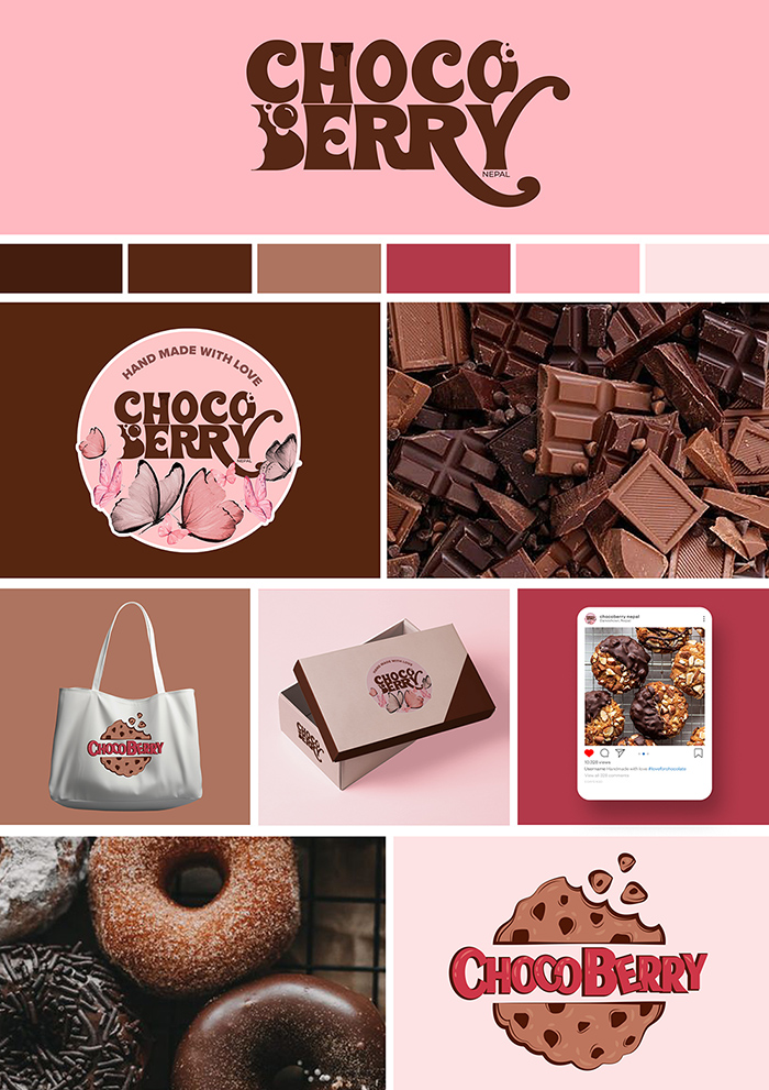
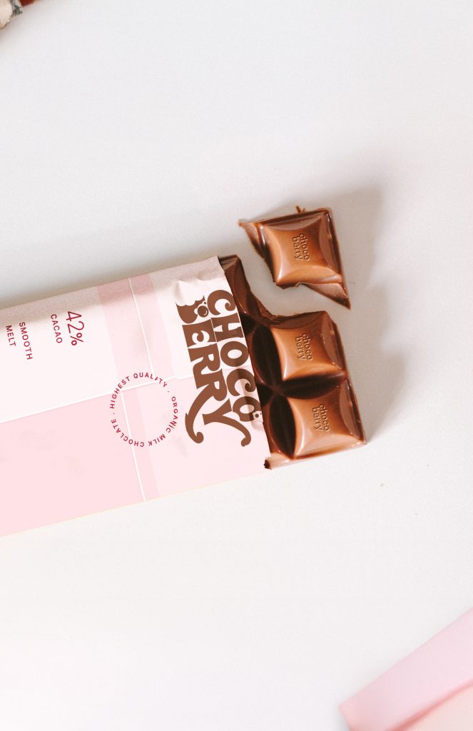
Chocoberry is a chocolate brand that fuses indulgence with freshness. The packaging immediately conveys its essence: a delicate pink backdrop paired with bold, retro-modern typography that feels both fun and sophisticated.
My role as a designer was to define Chocoberry’s visual language ensuring consistency across packaging, digital media, and brand communication, while capturing the joyful, youthful vibe that this chocolate represents.
Audience Insights
- Gen Z and Millennials: attracted to bold, stylish packaging and flavors with personality.
- Casual chocolate lovers: want approachable, fun branding instead of intimidating “luxury-only” visuals.
- Gift buyers: drawn to elegant but playful packaging suitable for sharing.
Market Gap
Most chocolate packaging falls into two extremes: luxury dark tones (black, gold, silver) or overly childish visuals. Chocoberry bridges this gap by being youthful, fresh, and chic.
Phase 1: Visual Identity
Logo
- Strong, rounded typeface that feels playful yet premium.
- Retro curves give it a nostalgic personality while still modern.
- Bold enough to stand out on shelves.
Color Palette
Inspired by the packaging:
- Berry Pink (#F4C6CC): Sweet, approachable, playful.
- Cocoa Brown (#5A3E36): Richness and indulgence.
- Cream White (#FDF6F0): Clean balance, minimalist tone.
- Accent Red (#C62828): Energy, passion, strawberry-inspired.
This palette moves Chocoberry away from predictable dark chocolates, instead positioning it as lighthearted, fun, and lifestyle-oriented.
Typography
- Display: Rounded, retro-inspired fonts with personality.
- Supporting text: Clean sans serif (Nunito, Poppins) for clarity on nutrition/labels.
Visual Language
- Patterns: Dripping chocolate swirls, playful berry dots, and geometric retro patterns.
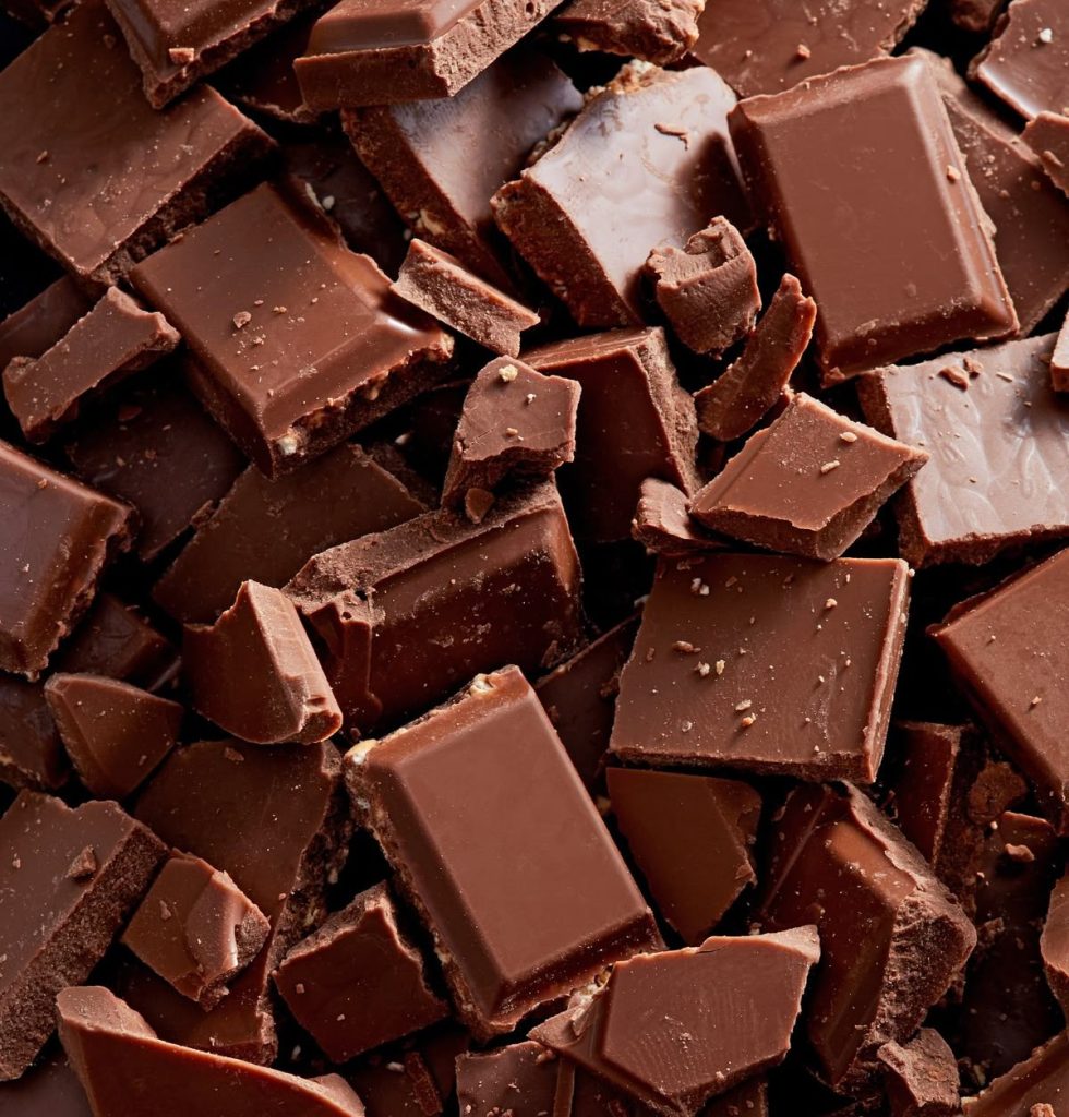
- Imagery: Melting chocolate squares, strawberries, lifestyle photography of friends enjoying chocolate.
- Tone: Youthful, playful, not too serious.
Phase 2: Brand Applications
Packaging
- Consistent use of pink tones and cocoa contrasts.
- Clear flavor differentiation with subtle accent hues (e.g., darker shades for dark chocolate, brighter pinks for berry editions).
- Minimalist front design the product name and cacao percentage stand out immediately.
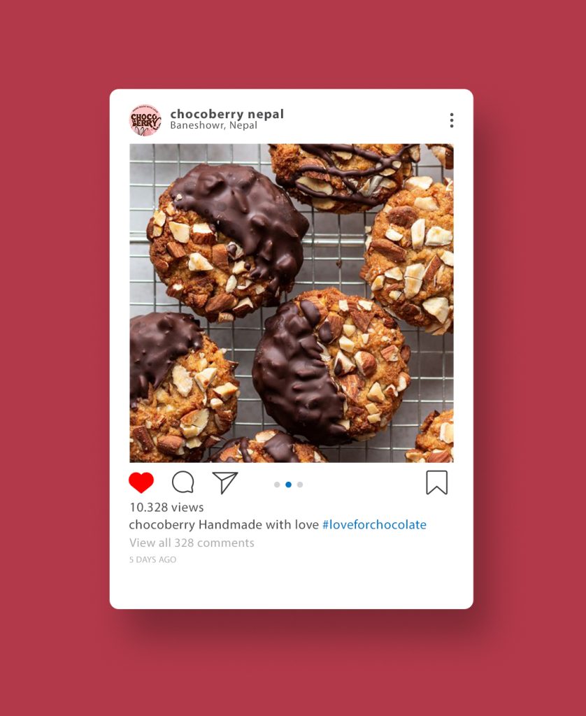
Social Media
- Content Ideas:
- “Berry Sweet Moments” campaigns featuring lifestyle photography.
- Quick, bold videos with melting chocolate animations.
- Engaging polls (“Dark or Milk?”) to build community.
- Visuals: Bright, fun layouts with pink and cocoa tones.
Merchandise
- Branded mugs with dripping chocolate graphics.
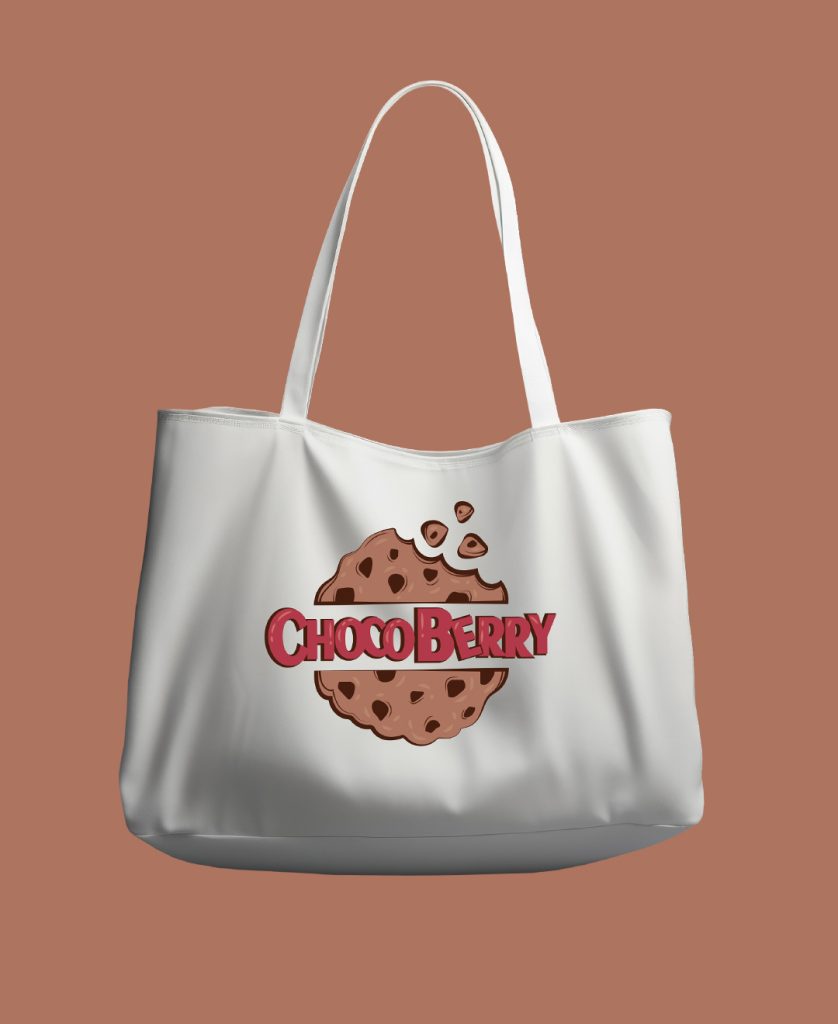
- Tote bags with pink-and-brown wordmarks.
- Seasonal limited-edition collectible tins.
Digital
- Website/App: Smooth scrolling animations with melting effects.
- E-commerce packaging previews: Interactive product rotation.
- Retail displays: Bold pink shelves with oversized Chocoberry wordmarks.
Phase 3: Brand Messaging
Possible Taglines:
- “Berry Sweet, Choco Smooth.”
- “Chocolate with a Twist of Fun.”
- “Not Just Chocolate — It’s Chocoberry.”
Tone of Voice:
- Playful, witty, cheeky.
- Relatable and youth-driven (like a lifestyle accessory).
- Warm and approachable instead of overly “serious gourmet.”
Designer’s Reflection
What makes Chocoberry unique is its balance: it feels playful without being childish and premium without being intimidating. The brand identity celebrates chocolate not only as a treat but also as a mood and lifestyle choice.
The pink-and-brown combination is a bold deviation from traditional chocolate branding, making Chocoberry instantly recognizable. This system allows for playful campaigns, seasonal packaging, and strong digital presence — while keeping the core identity intact.
In short: Chocoberry is sweet, stylish, and unforgettable.