When I began working on Freshly Nepal’s identity, the challenge was clear: how do we translate purity and health into visuals that appeal to both modern youth and traditional families?
Freshly Nepal isn’t just selling dairy, spices, fruits, and vegetables. It is advocating for a healthier lifestyle, promoting local organic farming, and encouraging mindful choices. My role was to create a visual language that captures this mission and turns it into a brand people can connect with every day.

Phase 1: Research & Insights
I started by exploring the audience mindset:
- Young consumers want fresh, stylish, and Instagram-worthy branding.
- Families look for reliability, safety, and trust.
- Across both groups, there’s growing awareness of organic, chemical-free living.
I also researched local competitors and global organic brands. Many leaned heavily on green palettes and over-complicated visuals. My design direction? Keep it minimal, clean, and authentic.
Phase 2: Visual Identity
Logo Direction
- A minimal mark inspired by leaves, sprouts, and the Himalayan mountains.
- Symbolizes freshness, growth, and Nepali roots.
- Designed to be versatile, works on packaging, tote bags, social media icons, or even a shopfront sign.
Color Palette
- Fresh Green (#6AB547): Energy, growth, vitality.
- Earth Brown (#8B5E3C): Organic, local, grounded.
- Cream (#F7F4EC): Simplicity and calmness.
- Sunrise Orange (#F4A261): Adds warmth and youthfulness.
This palette balances nature’s honesty with modern vibrancy.
Typography
- Headlines: Sans serif (Montserrat / Poppins) → bold, approachable, youthful.
- Body Text: Serif (Lora / Merriweather) → trustworthy, organic, easy to read.
The mix creates modern appeal while maintaining traditional reliability.
Visual Language
- Textures: Kraft paper, natural fibers, earthy surfaces.
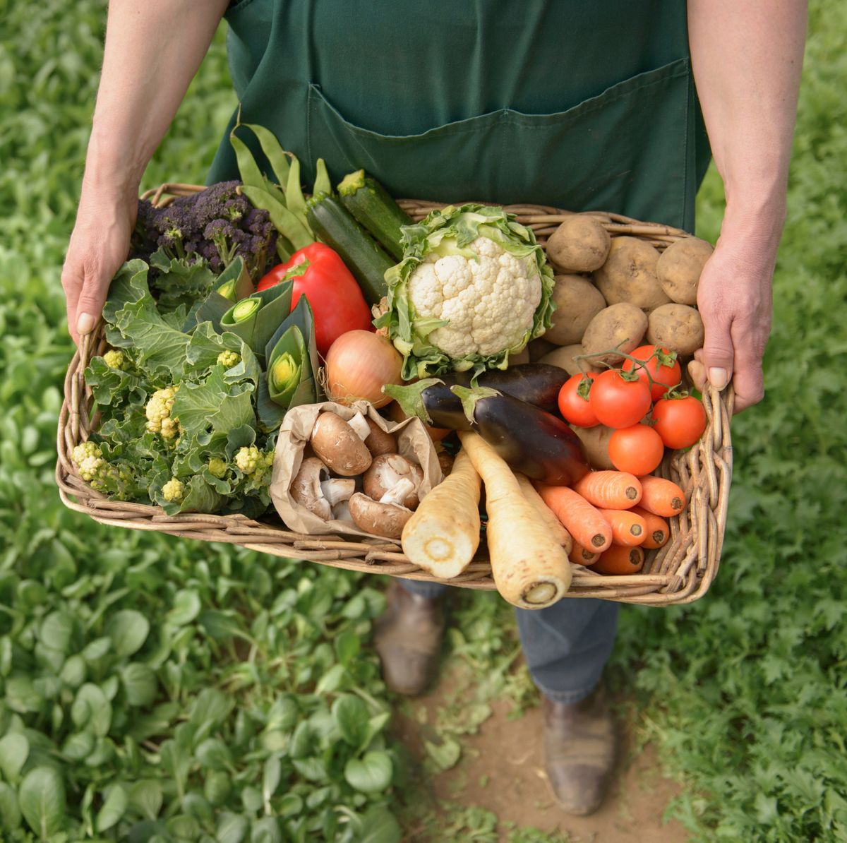
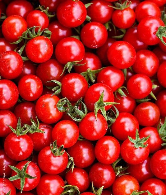
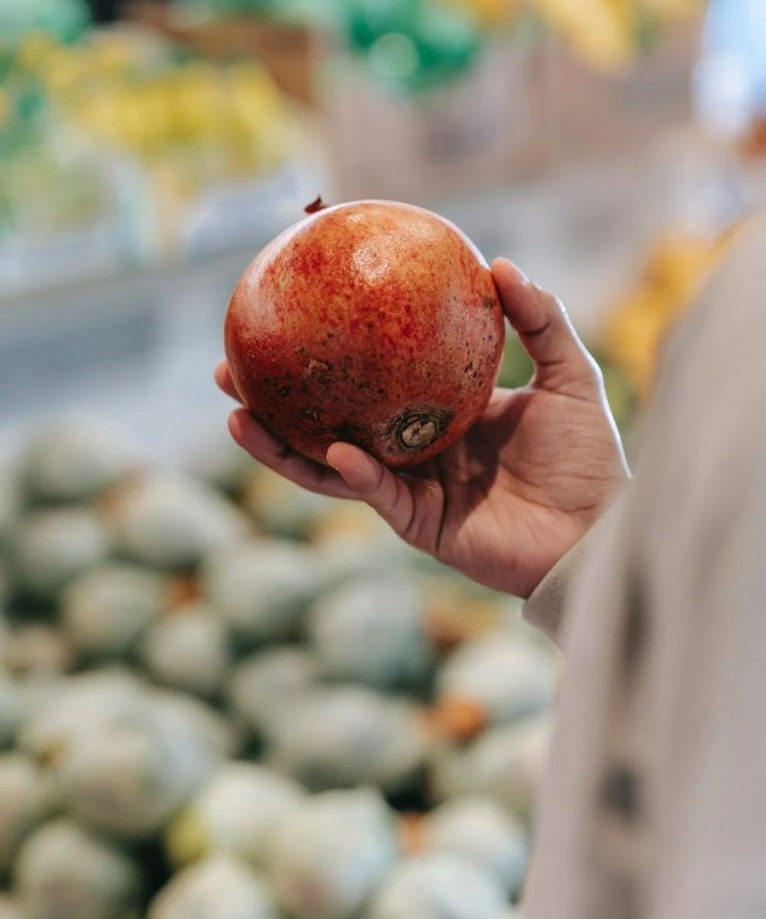
- Photography: Bright, natural lighting; close-ups of fresh produce; authentic farmer stories.
- Illustrations: Hand-drawn leaves, fruits, and patterns used sparingly for warmth.
Phase 3: Brand Applications
Packaging
- Eco-friendly kraft with minimalist illustrations.
- Transparent panels for dairy and produce to showcase freshness.
- Labels with clear “100% Organic” callouts.
Social Media
- Content Pillars: Wellness tips, recipes, behind-the-scenes from farms, conscious living.
- Visual Style: Clean layouts, earthy tones, pops of fresh green.
- Tone: Educational, friendly, transparent.
Merchandise
- Cotton tote bags with leafy patterns.
- Eco bottles and mugs with minimal wordmarks.
- Branded stationery for conscious customers.
Digital & Retail Experience
- Website: Clean grid, earthy color base, fresh product photography.
- Storefront: Modern design with wood textures, greenery, and minimalist branding.
Phase 4: Brand Messaging
Examples of brand copy direction:
- “Your health deserves honesty. Choose organic, choose Freshly Nepal.”
- “Pure food, pure living.”
- “Fresh today. Healthy tomorrow.”
Designer’s Reflection
This project was about balancing simplicity and authenticity. I avoided heavy ornamentation and instead focused on clarity, purity, and natural textures.
The end result is a scalable identity system: whether it’s a spice jar on a kitchen shelf, an Instagram carousel, or a storefront in Kathmandu, Freshly Nepal feels consistent, fresh, and trustworthy.
It’s not just branding, it’s a visual lifestyle statement.