When Brown Beans, a specialty coffee brand, approached me, their vision was clear: to create a modern yet warm identity that communicates quality, craft, and community. They wanted a design system that could scale across packaging, digital, and in-store experiences.
As the visual designer, my role was to shape a cohesive brand language through thoughtful color, typography, and visual storytelling.
Before diving into design, I immersed myself in Brown Beans’ world:
- Target audience: Young professionals and coffee enthusiasts who value authenticity and sustainable practices.
- Brand values: Warmth, craftsmanship, sustainability, and bold flavor.
- Design challenge: Build a brand identity that feels modern but approachable, reflecting the richness of coffee without being cliché.

Step 1: Research & Moodboarding
I explored the coffee culture, artisan packaging trends, and earthy aesthetics. The moodboard combined natural textures (wood, linen, kraft paper) with modern minimalism.
Step 2: Color Strategy
Coffee itself became the inspiration. I developed a palette that reflects depth, warmth, and energy:
- Espresso Brown (#4B2E2B): Represents richness, grounding, and authenticity.
- Cream Beige (#F5E6D3): Balances with softness, evoking steamed milk and warmth.
- Rust Orange (#C75B2A): Adds vibrancy and a sense of energy, like a roasted bean bursting with flavor.
- Sage Green (#8C9A82): A nod to sustainability and freshness.
Why this palette works: The mix of earthy neutrals and subtle accents mirrors the brand’s natural ethos while keeping it visually engaging.
Step 3: Typography
- Headline font: A bold serif with character (inspired by coffee shop signage) to bring craft and heritage.
- Body font: A clean sans-serif for readability across packaging and digital spaces.
This pairing keeps the brand feeling both artisanal and modern.
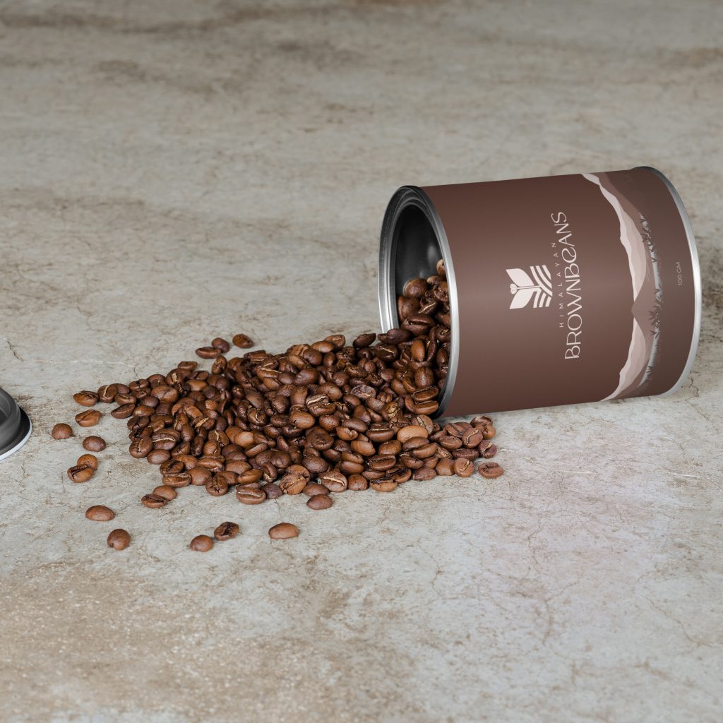
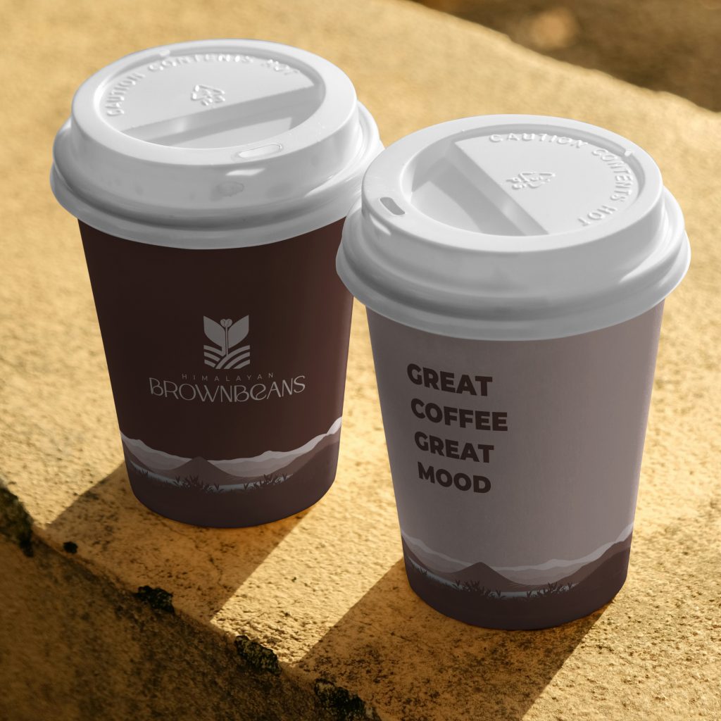
Step 4: Visual Elements
- Logo: A stylized bean shape doubling as a coffee cup silhouette—simple, memorable, and scalable.
- Patterns: Minimal line-based illustrations of beans and leaves for packaging.
- Photography style: Warm-toned lifestyle imagery highlighting community and ritual.
Step 5: Application & Mockups
I tested the system across:
- Merchandise (tote bags, mugs).
- Packaging (coffee bags, takeaway cups).
- Social media templates.
- A clean, modern landing page.

The final brand identity captures the soul of Brown Beans: a grounded yet modern coffee experience. With a warm palette, balanced typography, and a flexible design system, the brand feels approachable and premium at once.
Reflection & Key Takeaways
Design for scale: Every element works across both digital and physical spaces.
Consistency matters: Every touchpoint tells the same story.
Colors can set mood: Choosing hues from real coffee elements made the identity authentic.
This project reaffirmed that design is about more than visuals, it’s about creating a brand experience.